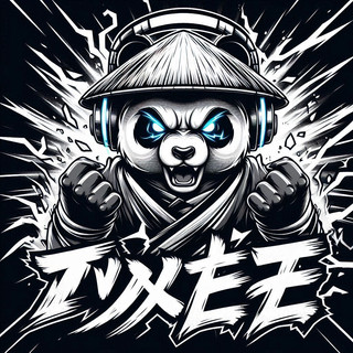
Designing Lasting Manga Characters: A 35-Year Pro's Guide (2025)
- Jim Wray
- Dec 30, 2025
- 18 min read
Introduction
When I first started drawing manga-style characters in the late 80s, my tools were cheap pens, copier paper, and recorded tapes of Voltron, Robotech, and whatever late-night anime I could find. Back then, I thought manga character design was just spiky hair, big eyes, and a cool pose. Decades later, after thousands of pages, I know that Designing Lasting Manga Characters: A 35-Year Pro's Guide (2025) is really about something deeper.
Most artists I meet fall into the same trap I did as a teenager. They have sketchbooks full of cool faces, wild outfits, and massive swords, but when I ask who the character is or what they would sacrifice everything for, the answer gets fuzzy. The drawing is strong, but the character vanishes from memory as soon as the page closes.
Long-term characters are built from the inside out. First comes concept and personality, then writing, then silhouette and style. Only after that do finished lines, tones, and polish really matter. Goku, Spike Spiegel, and Naruto Uzumaki are not just hair, outfits, and catchphrases. They are ideas with hearts and flaws, wrapped in visual designs that match who they are.
In this guide, I will walk through the process I use at Grumpy Panda when I build characters for comics, prints, and T‑shirts. We will move from concept and writing into shape, costume, details, evolution, and the technical side that locks everything in. If you want characters that live in a series, on a shirt, and in a fan’s head for years, this is the path.
“Readers return for characters first, everything else second.” — Advice from one of my first editors
Key Takeaways
Lasting manga characters start as concepts, not doodles. Define what they stand for, the conflict at their core, and how they fit the story before serious sketching. The pencil should record decisions already made in your head.
Strong writing gives a character a soul. Backstory, motivation, flaws, and a clear voice combine into someone who feels alive instead of flat. When those pieces are solid, visual choices stop feeling random.
Visual clarity matters as much as writing. A bold silhouette, clear posture, and clothing that fits their world make a character readable in a single glance.
Details work best when they mean something. Signature items, scars, evolving outfits, and controlled complexity act as visual symbols of growth, values, and history instead of empty decoration.
Real progress needs deadlines. Building and sharing at least one short manga or one‑shot gives feedback that sketches never will. Real readers and real pages push skills faster than endless planning.
The Foundation Of Character Longevity: Why Concept Trumps Cool

When someone shoves a sketch under my nose and says, “Check out my new character,” I always ask, “What role do they play, and what are they fighting inside themselves?” Most of the time, there is a pause. The design might be wild, but there is no clear idea behind it.
Starting with a “cool” drawing and hoping a story appears around it leads to hollow designs. Readers finish the chapter, close the book, and forget the character by the time they grab a snack. There is no anchor in their mind because there was no anchor in yours when you drew them.
A strong core concept is that anchor. It answers who the character is at their center and what conflict they carry. Kenshiro is strength and hope walking through a ruined world. Guts is rage and stubborn will pushed against impossible odds. Vash is a gentle soul who hates killing, trapped in a life that keeps pushing him toward it. Those ideas guide every pose, line of dialogue, and costume choice.
I treat that core idea as my North Star. Every choice I make has to point back to it. Before I ever draw, I write:
What their main function is in the story
What they represent to other characters
What internal fight keeps them up at night
At Grumpy Panda, every character that stayed with people started with those answers, not a hairstyle. Stay in the writing stage until the concept feels solid enough to describe in one sharp sentence with both purpose and conflict. When you have that, the pencil finally earns its job.
Building The Character's Soul: The Writing Phase

Before I think about boots or hair spikes, I build the internal world of the character. Many artists try to skip this step because it does not feel as exciting as sketching, but this is where long-term magic lives. A design with no inner life is just fan art of someone who never existed.
When I say soul, I am talking about three things working together:
Backstory and real motivation, not just a vague dream
Flaws and contradictions that cause trouble
Voice and worldview: how they talk, think, and see others
When these connect, the character starts “talking back” while I write. Great character work does exactly that.
“Description begins in the writer’s imagination, but should finish in the reader’s.” — Stephen King
Crafting Meaningful Backstory And Motivation
Backstory is not a boring list of events. It is pressure and damage that shaped the person readers meet on page one. I think of it like a forge where values, fears, and habits were hammered into place.
I always tie past events directly to a present goal:
What do they want more than anything?
What are they terrified of repeating or losing again?
Spike Spiegel is a simple example. His lazy attitude and bounty hunter life are not random “cool” traits. They grow out of a violent past with the Red Dragon Syndicate and a loss he never escaped. Every shrug hides something he does not want to face.
For my own characters, I often write more history than readers will ever see. I need to know the big mistake, the person they let down, the promise they failed to keep. Simple goals like “be the strongest” get a deeper layer such as “because I could not protect someone before.” Once that deeper reason is clear, motivation has enough weight to drive a whole story.
Designing Flaws And Internal Contradictions
Perfect characters feel fake. Real people mess up, argue with themselves, and act against their own best interests. When I design a lead without real flaws, I know I am creating a flat arc that will not stick.
I like to build characters out of contradictions:
Brave but reckless
Kind but avoiding conflict
Smart but terrible at reading people
These clashes inside one person create great scenes because the character is always a little at war with themselves.
Vegeta is still one of the best examples. His royal pride pushes him to train harder than anyone, but that same pride poisons him with jealousy and a massive inferiority complex around Goku. That tension powers his growth across Dragon Ball Z. My simple rule: pick one core strength, then ask what flaw naturally grows out of it. That pairing gives an endless source of conflict and change.
Establishing Voice And Worldview
Once I know where a character came from and what cracks they have, I focus on how they see the world and how they talk about it. Voice is more than catchphrases. It is:
Word choice and rhythm
How much they speak (or do not)
What they notice first in any scene
A character raised in high society will use more formal language, even when angry. Someone raised on the streets will talk faster, cut words short, and read danger before anything else. Jotaro Kujo barely talks at all, and that silence is his voice. His short replies say, “I am tired, blunt, and not interested in nonsense.”
I test voice by writing quick, throwaway conversations between my character and others, even if those scenes never appear. If I can cover the names and still know who is speaking, the voice is strong. Then I stay consistent across dialogue and inner thoughts so the reader always feels the same mind behind the words.
The Power Of The Silhouette: Visual Design Fundamentals

After the writing phase, I finally draw. The first visual test is not eyes or costume details. It is the silhouette. If I can fill the character in with solid black and still know exactly who they are, I am in good shape.
Think about the characters burned into our memories:
Goku’s hair reads from a mile away
Sailor Moon’s twin buns and streaming hair form a clear outline
Guts is a walking wall with a giant sword
Alucard’s coat and hat create a sharp, dramatic shape
My professional approach is to start with big shapes. I block in head, torso, and limbs, then play with posture and main clothing pieces. I ask:
How tall or stocky do they feel?
How does the hair affect the outline?
Does a coat, scarf, or weapon change the shape in a good way?
Signature clothing elements matter a lot here. A long coat, cape, wide boots, massive belt, or distinct hat can become part of that instant read. In crowded pages, a strong silhouette helps the eye find the right person in seconds.
At Grumpy Panda, this rule helps me design characters that work both in panels and as shirt prints. When I am happy with a design, I do one last test: I fill the entire character with black. If it still feels like a strong, clear figure with attitude, the rest of the design work becomes much easier.
Designing From The Inside Out: Translating Personality To Appearance
Now we reach the part most people rush into first. Designing from the inside out means letting every visual choice grow from the personality, backstory, and concept you already wrote. Instead of asking, “What would look cool,” I ask, “What would this person honestly wear, how would they stand, and what marks has life left on them?”
When I work this way, art and story stop fighting each other—research on unleashing the power of animation in marketing shows that visual storytelling resonates most when design and narrative work in harmony. The look and the writing point in the same direction.
Body Language And Posture As Character Communication
Before costume, I think about how the character holds their body. Confident or arrogant people usually stand tall, shoulders back, chest open. They take up more space without trying. Shy or anxious people often shrink, hunch their shoulders, or fold their arms for protection.
L from Death Note is a perfect study. He slouches, crouches, and perches on chairs in ways no one else does. His strange posture tells us he lives in his own head and does not care about normal behavior. You know something is off before he says a word.
I like to sketch a “neutral” standing pose that still shows who they are. Even standing still, do they look relaxed, tense, ready to fight, or lost in thought? I try to keep that posture consistent across panels so the body language becomes as recognizable as the face.
Costume Design As Self-Expression And World-Building
Clothing is where personality, history, and world-building all meet. A practical character who works with their hands will reach for sturdy boots, reinforced gloves, and gear that can take a beating. Someone who loves attention will choose bright colors, dramatic shapes, and items that move or shine when they walk.
The condition of the clothes adds another layer:
Neat, pressed uniforms suggest discipline, money, or obsession with control
Torn sleeves and patched knees suggest a hard life or constant fighting
Color choices can hint at mood: reds for fire and passion, blues for calm or sadness
When I design for Grumpy Panda prints, I think about how an outfit will read on both a manga page and a shirt. Classic anime from the 80s and 90s did this well. Outfits matched each character’s job, power level, and mood while still working as simple poster art. I follow the same idea: the outfit has to match climate, culture, and role in the story, not just my mood that day.
Strategic Use Of Accessories And Details
Once the big shapes and main outfit work, I add a few details that say something extra. Accessories are perfect for this. A sketchbook, camera, toolbox, or deck of cards each sends a different message. Rings, necklaces, and bracelets can hint at family, love, or belief.
I pick only a few items and tie each one to backstory. Maybe a wristband came from a lost friend, or a pendant marks a team or clan. If I throw on too many gadgets, the design turns into noise. Two or three honest, meaningful details make the character feel lived in without clutter.
Iconic Details: Signature Items And Physical Markings
Once the main design works, I think about the touches that can become symbols. These are the parts fans doodle in their notebooks. The silhouette might hook people first, but the right details are what they talk about years later.
Some of these are objects that always stay with the character. Others are scars, tattoos, or unusual traits that carry their history on their skin.
The Power Of Signature Items
A signature item is an object tied so closely to the character that you cannot picture one without the other. It might be a weapon, coat, hat, or small object. The key is that it stands for something deep, not just style.
Luffy’s straw hat is not just sun protection. It is a promise, a dream, and a reminder of the person who passed it on. Kenshin’s reverse blade sword is a physical sign of his vow not to kill again, even though his skills were built for the opposite.
When I design signature items, I build them from the core concept:
Regret might link to an item from the event that haunts them
Hope might tie to a gift from someone who believed in them
I keep the object simple enough to draw quickly, but distinct enough that fans could sketch it and everyone would know whose it is.
Scars And Physical Markings As Visual History
Scars and other marks work like tattoos from the story itself. Each one silently records something that hurt, changed, or defined the character. Used well, they make readers want to ask, “What happened there?” even before the plot answers.
Kenshin’s X‑shaped scar tells a full tale of love, guilt, and betrayal without a word. Edward Elric’s automail limbs are a constant reminder of a terrible mistake and the price he paid. Every action he takes carries that weight.
When I add marks like this, I always link them to a specific event in the backstory. If I cannot explain where it came from and why it matters, it does not stay. I also limit the number. One or two meaningful scars or unusual features hit harder than a body full of random scratches, and they are faster to draw from many angles.
Planning Character Evolution: Designing For Growth
Characters that stay with us from youth to adulthood do not stay the same forever. They grow, win, fail, and change. If the design never shifts with that growth, the art feels frozen while the story moves.
When I start a long project, I think about how my lead will look at the beginning, middle, and later stages of their arc. I am not just planning plot points. I am planning visual phases that match those turns so readers can see progress as they flip pages.
Subtle Transformations And Their Meaning
Not every change has to be dramatic. Small shifts can say a lot if they match real development. A new haircut after a loss or big decision can mark a fresh start. Letting hair grow out can show time passing or a more relaxed attitude.
I also use grooming and posture. Someone who starts off messy and slouched might stand straighter and keep their outfit sharper as they gain confidence. A character who once wore bright layers might tone things down after a serious event. Readers notice these quiet edits even if they never talk about them.
At Grumpy Panda, I often use a new jacket, a replaced patch, or an added bandage to mark stages of an arc. Planned ahead, these touches act like visual bookmarks for the reader and for me.
Dramatic Visual Overhauls
Sometimes the story calls for big, bold change. A new power level, a shift in role, or a huge personal decision can all justify a full redesign. The key is that the new look must feel earned by the events leading up to it, not like a random costume swap.
Gohan’s path—from crying kid in an oversized gi, to teen balancing school and training, to calm, focused Mystic Gohan—has clear visual stages. Naruto’s rise from orange jumpsuit troublemaker to Hokage in a formal cloak works the same way. You can trace their whole rise just by flipping through outfits.
When I plan large changes, I sketch versions for each phase early on. I keep one or two core elements the same, like hair shape or a symbol, so the character stays recognizable even in a new form. Done well, these shifts feel like a reward for readers who have followed the arc from chapter one.
Technical Execution: From Concept To Finished Character
All the planning in the world will not help if the final design is painful to draw or falls apart inside real pages—as noted in the Report on the Specific influence of production constraints on creative output, technical execution must balance artistic vision with practical repeatability. This is where I take the concept, writing, and sketches and turn them into something I can use across chapters, merchandise, and promo art.
My focus here is balance: enough detail to feel rich, but not so much that I regret it by chapter five. I also build strong references so I do not drift off model under deadlines.
Balancing Detail With Drawing Efficiency
One of the biggest traps I see is artists loading a character with tiny armor plates, chains, and patterns that look amazing in a single splash image. Then they try to draw that same design in a fight scene from three angles and suffer for it.
Early in my career, I created designs that took twenty minutes just to ink the boots. That does not work on a long series or even a tight one‑shot. Now I aim for designs clean enough to sketch from memory in a few minutes while still feeling like themselves.
My rule: if I cannot draw the full character from memory in under five minutes and have it look correct, the design needs trimming. Many classic 80s and 90s characters that carried whole franchises had simple core designs. The interest came from how they moved, how they were framed, and what they went through, not from fifty belts on one leg.
Creating Character Model Sheets
Once the design feels solid, I lock it down with a model sheet. This is my cheat sheet and safety net. It shows:
Front, side, and three‑quarter views
Close‑ups of the face and key details
A few basic expressions (happy, angry, sad, surprised, neutral)
A height line‑up with other main characters
If I work in color, I include a palette and notes on materials. Accessories and signature items get their own callouts.
This practice is standard in manga and animation, and it saves time later. For digital work, I keep the model sheet open beside my pages. For traditional work, I tape a printed copy near my desk so I can glance up instead of guessing.
“We all have 10,000 bad drawings in us. The sooner we get them out the better.” — Walt Stanchfield
Model sheets help make more of those drawings good ones.
Designing For Panel Presence
A character design does not live on a blank page. It has to work inside panels with camera angles, word balloons, and other characters. I think about that while I am still adjusting shapes and clothing.
Large, imposing characters might break panel borders or dominate frames with wide shoulders and flowing coats
Nervous or sneaky characters might be drawn smaller, tucked into corners, or half‑hidden
Long hair, scarves, and capes can guide the reader’s eye across the page
When I think this way, the character stops being just a design and becomes part of the storytelling language.
Inking And Finishing: Bringing Professional Polish To Your Character
Once the pencils are clean and the design feels solid, inking and finishing decide whether the character looks amateur or professional. Two artists can ink the same pencils, and one will feel flat while the other jumps off the page.
I grew up on traditional pens and tone sheets and now mix those habits with modern digital tools. The tools changed, but the principles did not. Line weight, tone, and effects work together to support the design.
The Art Of Inking And Line Weight
Inking is not tracing. It is drawing the final version with full intent. The way lines change thickness can suggest weight, light, and focus.
I usually:
Make outer edges a bit thicker to separate the character from the background
Use heavier lines in deep shadow
Reserve thin lines for hair strands, small folds, and minor details
Good line weight makes a character feel solid and three‑dimensional. It also guides the viewer’s attention. Thicker, darker areas pull the eye; lighter lines sit back. Whether I use traditional G‑pens and maru pens or digital brushes that mimic them, I think about this rhythm of thick and thin across the figure.
Keeping line treatment consistent from panel to panel also helps characters feel stable in the reader’s mind.
Toning, Effects, And Final Presentation
In black and white manga, tones stand in for color and atmosphere. I use:
Light tones for bright scenes and softer moods
Darker tones for danger, sadness, or heavy moments
Placing tone on clothes or hair can separate a character from the background or push them into shadow. I started with adhesive sheets and knives; now I often use digital tone libraries.
Either way, the goal is the same: make the character feel rooted in the world, not like a sticker.
Sound effects and motion lines are part of this final layer. A bold effect around a punch or leap supports the impact promised by the design. When these finishing touches are handled with care, the difference between a sketch and a finished manga panel is obvious.
Setting Goals And Entering The Arena: A Pro's Mindset
After 35 years, I can say this plainly: no guide, including this one, matters if the work never leaves the sketchbook. The artists who grow set real goals and step into spaces where people can see and judge their characters.
One of the strongest goals I suggest is simple:
Create a short, self‑contained manga or one‑shot built around one or two characters designed with the steps from this guide.
Pick a contest, anthology, or online event and aim to submit it.
Deadlines and rules force hard choices that loose planning never does.
“Amateurs sit and wait for inspiration, the rest of us just get up and go to work.” — Stephen King
Finishing that project is worth more than any number of half‑finished “someday” ideas. When I was younger, I entered contests, printed mini‑comics, and posted rough work long before I felt ready. Some flopped. Some did well. All of them taught me something I could not have learned from drawing in private.
At Grumpy Panda, I treat every print run, shirt design, or comic release as a test of whether these characters really land with people who love anime and manga as much as I do.
Feedback matters:
Positive reactions show what connects
Thoughtful criticism points at weak spots in design, writing, or clarity
Do not wait for the perfect idea or flawless design. Those do not exist. Build a character with heart, give them a story, finish something they star in, and share it.
Conclusion
If you remember one thing from all this, let it be that lasting manga characters grow from the inside out. The drawing is not step one. Idea, conflict, history, and voice come first. Once those are clear, silhouette, costume, and final polish have something solid to rest on.
We walked through concept and writing, then shape and posture, clothing, scars, and signature items. From there, we looked at how designs can change along with the character’s arc and how to keep art practical for real deadlines. Finally, we touched on inking, tones, and the mindset needed to put finished work in front of real readers.
The characters that survived from the 80s and 90s to now did not last by accident. Their creators, whether they talked about it or not, leaned on these same fundamentals. After three and a half decades at the drawing table, I can say that tools and trends changed, but these basics stayed firm.
At Grumpy Panda, my goal is to carry those lessons forward while still having fun with modern tech, prints, and shirts that speak to fellow Gen X and Millennial fans. Every time I design someone new with this process, I feel a little closer to the artists who shaped my own childhood.
The next character that sticks in someone’s head for thirty years has to start somewhere. Let it start with you, a blank page, and a willingness to do the work.
FAQs
Question: How Long Should I Spend On The Writing Phase Before I Start Drawing?
For a main character, I recommend several hours of focused writing, often spread over a few days. That time lets ideas settle and gives space for better questions. A couple of days of strong concept work can save weeks of tearing apart a design that does not fit the story. Even after decades, I never skip this stage. When I can talk about a character’s history, goals, and fears without checking notes, I know I am ready to draw them.
Question: What If My Character Design Looks Too Similar To An Existing Character?
This worry is common, especially for people raised on the same classic shows and comics I love. Many characters share surface traits like spiky hair or certain outfits, and that is fine. What separates them is the inner life, the core idea, and the mix of details. If your design feels too close to someone famous, try changing:
Major silhouette elements like hairstyle or coat shape
The signature item or main accessory
Color balance or posture
Remember that real originality comes from the mix of personality, backstory, and design, not just one hairstyle.
Question: Should I Design In Black And White Or Color First?
The best choice depends on where the character will live. If the plan is a traditional manga‑style book, black and white should guide most decisions. For webcomics or scroll‑style series that use full color, it makes sense to think in color from the start.
Even when I work for black and white print, I like to imagine a loose color scheme because it helps with covers and later merchandise. Strong designs hold up in both because they are built on clear shapes first.
Question: How Many Design Iterations Should I Create Before Finalizing?
For important characters, I aim for at least three to five different rough designs. Each version pushes the idea in a new direction and helps reveal what really fits the concept. Even now, I sketch several takes before I commit to one. After around ten serious attempts, the gains usually get smaller, and it is time to decide. Exploring options is part of the process, not a sign that you are failing.
Question: What's The Biggest Mistake You See Beginner Character Designers Make?
The biggest mistake is starting with cool visuals and no clear concept or personality behind them. A close second is burying designs under tiny details that look great in one drawing but are painful to repeat in many panels. The third common issue is designing characters without thinking about the story, world, or cast they need to fit into.
Strong character design means thinking like a storyteller, not only as an illustrator. From what I have seen over the years, the artists who accept these lessons and practice the basics are the ones who build bodies of work that stand the test of time.


Comments